Branding
Brand identity
Office for Veterans’ Affairs
The challenge
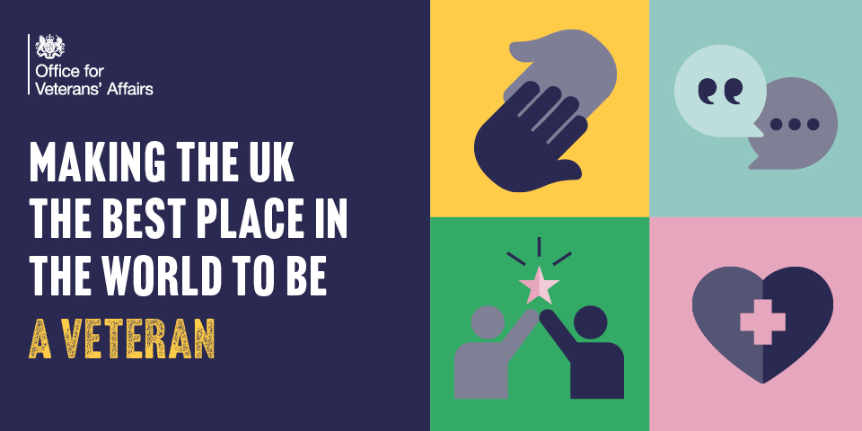
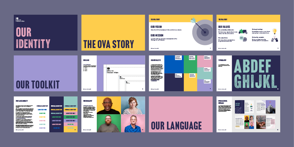
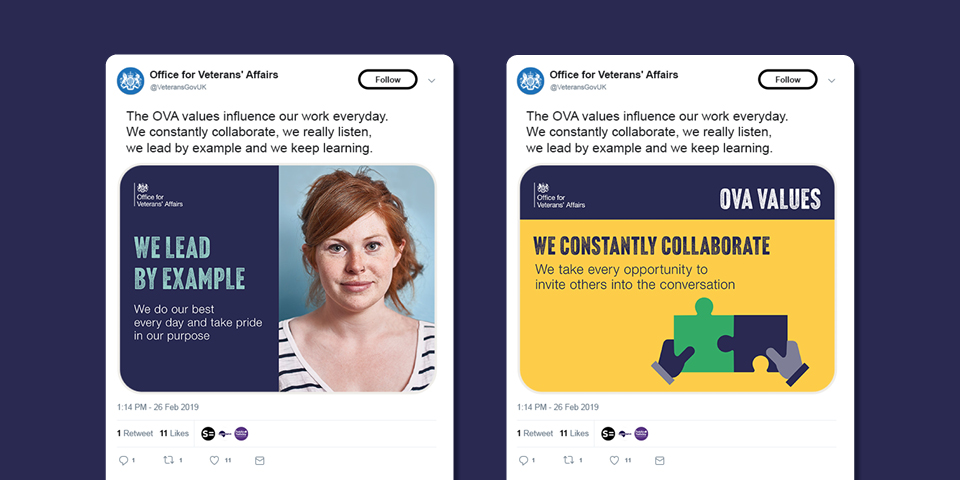
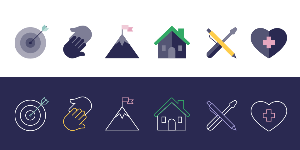
The Office for Veterans’ Affairs was set up in 2019 and aims to make the UK the best place in the world to be a veteran. We were asked to create a brand identity to help unlock their ambition and build brand recognition. The brand needed to resonate with their staff and partners as well as the veterans they support.
Our solution
We created a vibrant and emotive brand that smashes stereotypes and recognises the unique contribution veterans make to society. Photography and bright block colours give the brand a modern and engaging look, while simple icons, textured typography and a unified tone of voice all bring a human touch.
Oxford-Cambridge Arc
Department for Levelling Up, Housing and Communities
The challenge
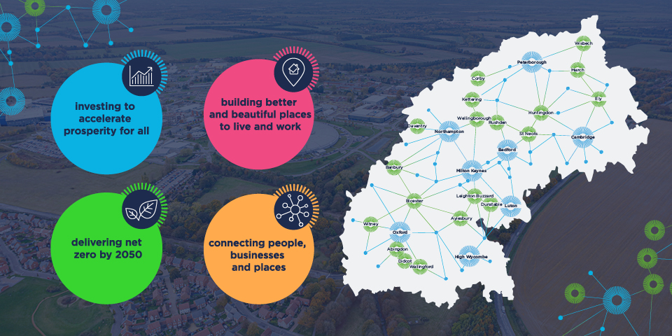
The Oxford-Cambridge arc is a globally significant area, home to scientific innovation and economic opportunity. Investment is transforming the arc into a world-class economic hub and a beautiful place to live and work. We were asked to create a brand for the arc that conveys a sense of national pride, evokes innovation, and shows collaboration between government, businesses and the local economy.
Our solution
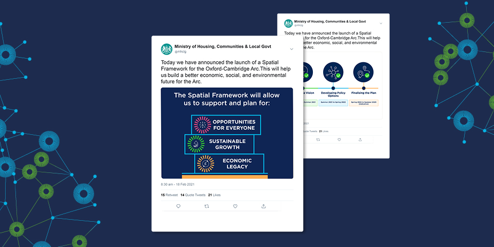
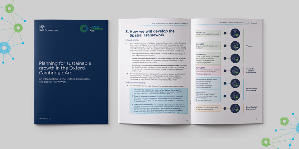
We designed a professional, flexible brand that captures the potential of the Ox-Cam arc across social media, policy papers and an animation. The central graphic device consists of an abstract O and C which form a lightburst shape. It is combined with a map graphic which represents important locations in the Ox-Cam arc and highlights the connections and opportunities that will lead the arc into the future.
Rebrand
Emergency Services Network
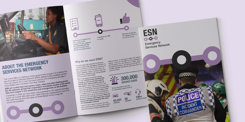
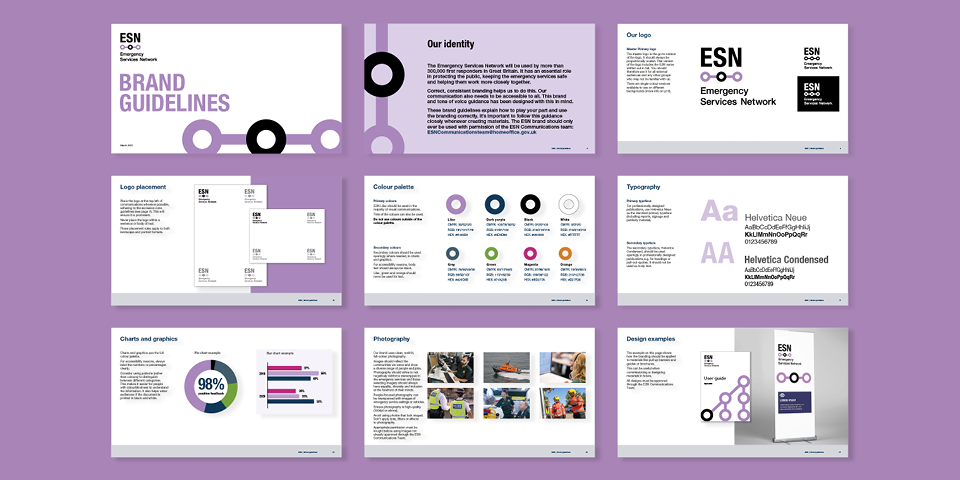
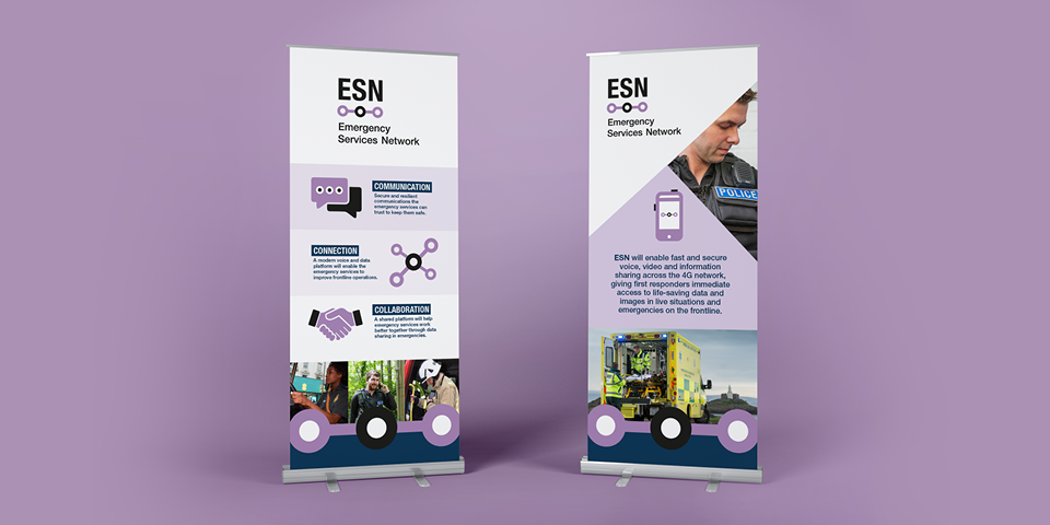
The challenge
The Emergency Services Network is a new critical communications system that will be used by over 300,000 emergency service workers in Great Britain, including ambulance and fire and rescue teams. We were asked to create a simple, digital-focused brand to ensure the system is easy and intuitive to use in high-pressure situations.
Our solution
The simple brand focuses on the Emergency Services Network’s role in keeping workers connected. Straight lines and rounded shapes join up to represent direct communication and teamwork. This uncluttered approach means that users can navigate and find information quickly, supporting their life-saving work.
Brand refresh
Office for Nuclear Regulation
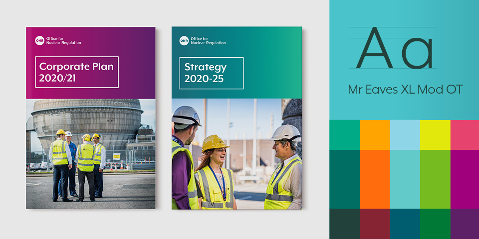
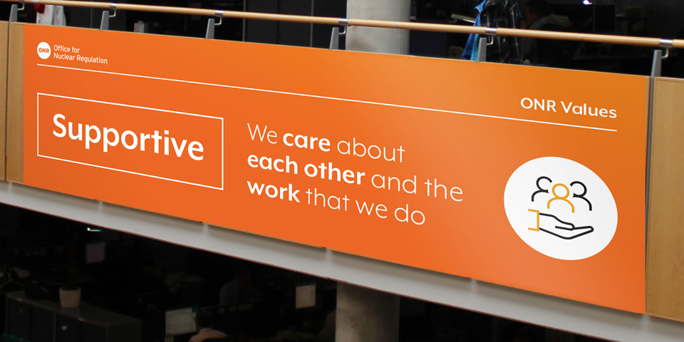

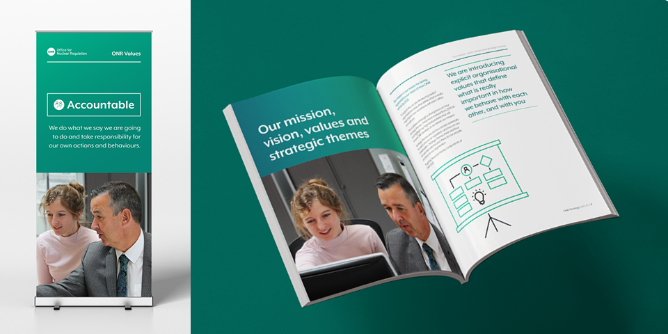
The challenge
Following our successful rebranding for ONR in 2016, we were asked to refresh the brand in order to reflect ONR’s new five-year strategy and strategic areas. We needed to convey the same personal approach and sense of pride in ONR’s long history of maintaining a safe nuclear industry, while also bringing a new energy to the brand that would work across both print and digital.
Our solution
We provided a new look and feel alongside comprehensive brand guidelines to signal a new chapter for ONR. We designed icons for the four strategic areas and updated the font, mission and values statements, and office stationery. An extended colour palette accommodates both formal corporate reports and vibrant creative materials, ensuring the brand makes an impact in print and digital formats.
SpaceUK magazine
UK Space Agency
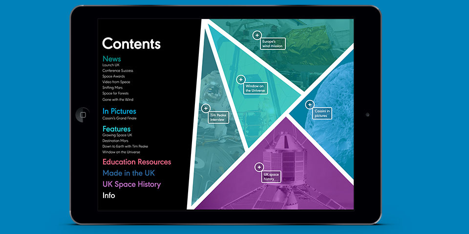
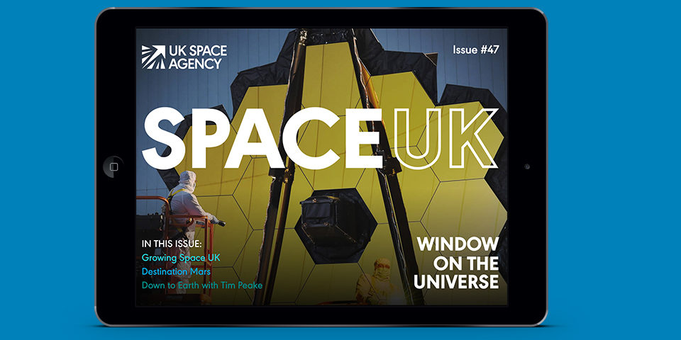
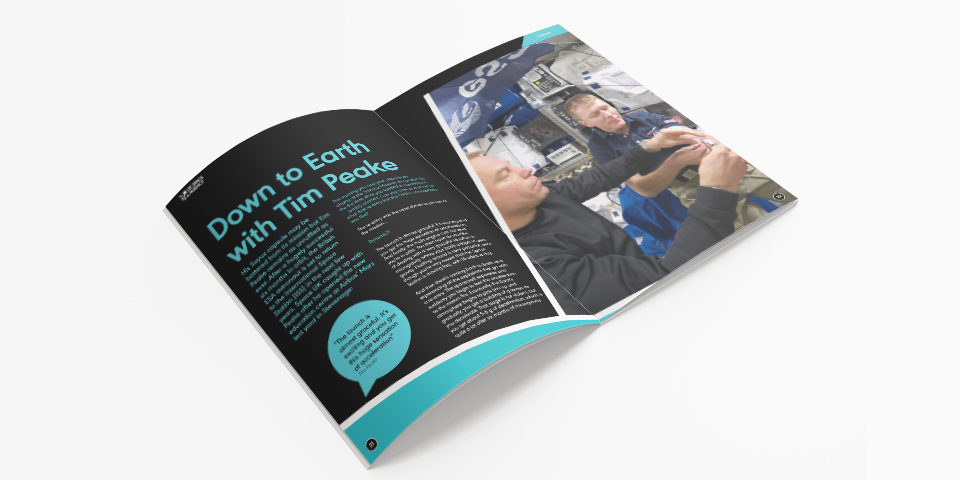
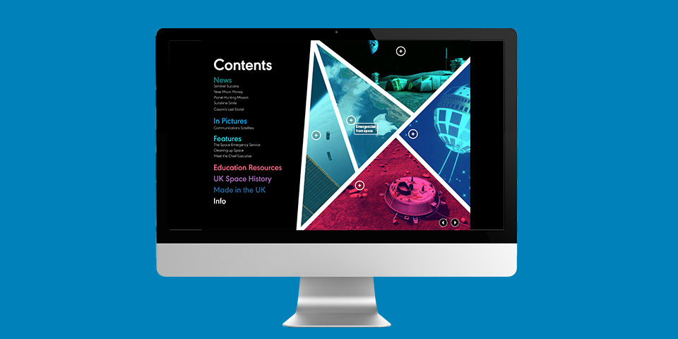
The challenge
We worked with the UK Space Agency to refresh their brand. They asked us to apply this brand to their magazine, SpaceUK, which provides sector news and educational material for a public audience. It was important to find creative ways to engage and reach new audiences.
Our solution
Space is all about discovery and we wanted this to be reflected in the design. The bright colours and angular shapes bring the magazine to life. The new digital version is fully interactive so readers can immerse themselves in the images and articles in a new and exciting way.
Great work starts with a conversation
Get in touch